Marketing

Holiday Product Photography: 7 Essential Checks for Great Visuals

Holiday product photography should help shoppers understand what they will receive: appearance, scale, useful details, and packaging. A consistent plan can support clearer buying decisions without an expensive studio. Start with the actual product and the questions customers need answered, then plan the seasonal styling around that information.
This guide covers planning holiday product photography: why visuals matter in peak season, building a shot list, simple setups, editing for consistency, and preparing images for store and social.
Write the list before you touch a camera. For each key product:
Add a few seasonal lifestyle images you can use for banners, emails, and social posts.
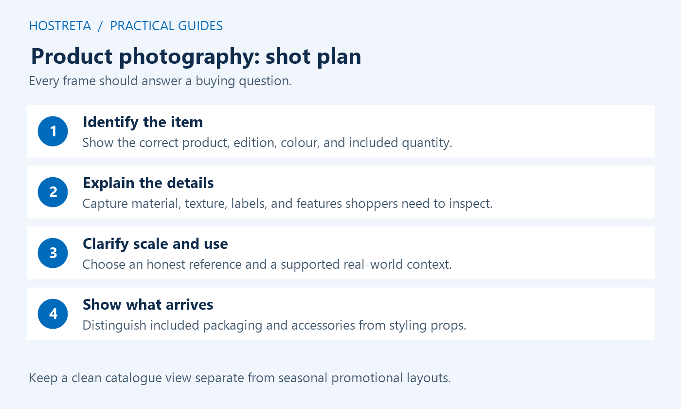
Use this workflow to prepare the shoot, review existing assets, and deliver suitable versions for the catalogue and campaign. It is a planning guide rather than a promise of a particular sales result. If the store already has approved photographs, audit those first. New product photography is useful only when it answers a missing customer question or replaces an inaccurate or unusable image.
Write down the exact item, variant, colour, size, included accessories, and packaging version before planning product photography. The photographer needs to know which objects belong to the offer and which are props. A decorative mug, ribbon, or gift box can imply an included extra if the composition does not make its role clear. Use captions or supporting copy where the distinction matters.
For a physical book, show the correct edition and cover. For an ebook, a cover mockup can illustrate the digital product, but it should not imply that a printed copy is shipped. For a bundle, make the included quantity and components unambiguous. Check that the visual brief agrees with the product description and fulfilment team before arranging an attractive but misleading scene.
Define the buyer’s main questions: What does it look like? How large is it? What material is it made from? What arrives in the package? Which detail distinguishes the variant? Product photography becomes more useful when each planned frame answers one question. Seasonal decoration should support that information without obscuring the product or changing its apparent size.
Create an inventory by product and variant. Record the current main image, gallery coverage, original file location, usage rights, and any known problem. Mark assets as reusable, requiring a new export, or requiring a new capture. This makes product photography planning concrete and avoids paying to recreate a perfectly usable image just because it lives in an untidy folder.
Check whether the product or packaging has changed since the photograph was taken. An old label, outdated cover, or discontinued accessory can cause confusion even when the file is sharp. Review the image at the size customers actually see, including small catalogue thumbnails. A photograph that works as a large desktop banner may fail when reduced to a mobile product card.
Prioritise best-selling products, campaign items, new releases, and products with missing essential views. Do not base the entire schedule on the number of photographs per product. A clear detail image can be more valuable than several similar angles. Agree on the minimum complete set for each product before expanding into optional seasonal content.
A practical product photography shot list includes an asset identifier, product code, variant, shot purpose, orientation, crop allowance, and approval owner. Use a clean catalogue image for identification, then add details, scale, use, and packaging as needed. Keep a plain product view separate from a heavily styled campaign banner so one image is not forced to serve conflicting requirements.
Plan negative space where a campaign may place a heading, but keep the product readable in narrower crops. Capture an alternative composition if a square card and vertical story need different framing. Avoid assuming one landscape frame can be cropped into every channel. A few deliberate variations during the session can prevent awkward cuts and expensive reshoots later.
Specify a truthful scale reference. If a hand or familiar object appears in the frame, its size and placement should clarify rather than exaggerate the item. For a close-up, explain its purpose in the gallery order so the detail is not mistaken for the full product. The shot list should make these decisions before the team starts arranging the lights.
Mark the camera position, product position, background, and light direction. Record the setup with a reference frame so another session can match it. A phone and tripod can be adequate when focus, exposure, and lighting are controlled. Expensive equipment will not compensate for inconsistent framing or an inaccurate sample. Use a stable surface and keep cables and stands clear of the working area.
Keep lighting consistent across colour variants. Mixed daylight and artificial light can create unwanted colour shifts, so choose a controllable setup and review a neutral reference. Avoid editing every variant until it matches a preconceived colour that the physical product does not have. Product photography should represent differences that buyers need to distinguish, even when perfect colour matching across all screens is impossible.
Check sharpness on the important feature rather than relying on a small camera preview. Inspect reflective surfaces, tiny type, transparent packaging, and texture. Keep several usable exposures if the product is difficult to capture, but select a clear final rather than overwhelming the gallery. Take a short review break before dismantling the setup so missing or soft shots can be corrected.
Use a consistent crop, background treatment, brightness range, and export naming pattern. Remove incidental dust or distractions without removing a real product feature, changing the included contents, or disguising damage on the item actually sold. Retain the original and an editable master. A reversible product photography workflow makes corrections possible when another reviewer notices an inaccurate detail.
Review seasonal styling for implied claims. A gift-ready scene should match the packaging option customers can actually buy. A demonstration should show supported use rather than an invented capability. If a mockup or generated background is used in a future campaign, inspect the product outline, text, scale, and included accessories carefully and label the presentation where necessary for clarity.
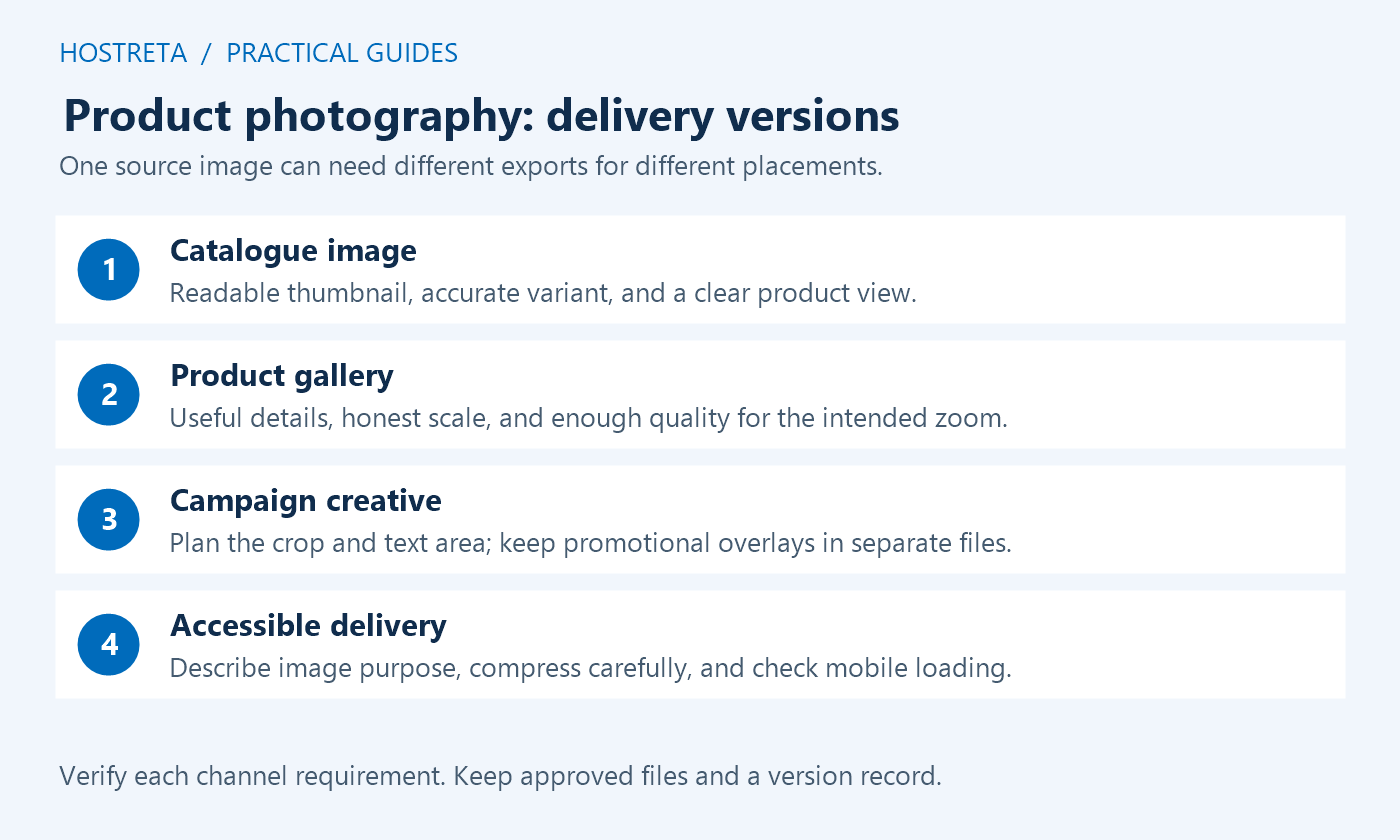
Keep channel-specific promotional text in separate layouts. A sale banner on the website may include a discount or call to action, while a main product image submitted to a shopping feed can have different rules. Google’s main image requirements distinguish product imagery from promotional overlays. Verify each destination’s current requirements instead of exporting one branded graphic everywhere.
Choose export dimensions from the actual template, device sizes, and zoom requirement. Compress a derivative and compare it with the original at normal viewing size. Check text, edges, gradients, and colour detail. Product photography should remain useful after compression. Keep a high-quality master so a later design change does not require enlarging a small, degraded web export.
Write concise alt text that describes the image’s purpose in context. A useful example might identify a front view, colour, or visible detail, rather than repeat the same keyword on every image. Decorative imagery may need different treatment. Google’s image search guidance supports descriptive context; it does not justify stuffing search phrases into accessibility text.
Test responsive images, layout space, and the gallery on mobile. Do not lazy-load a main image that is the measured critical visible resource merely because a global optimisation switch offers it. Defer genuinely off-screen media where appropriate. Coordinate delivery with the product-page performance checks so attractive assets do not produce a slow or unstable buying interface.
Preview the product card, detail gallery, variant selection, social link preview, email, and campaign banner. Check the image order and make sure the selected variant shows the correct product. A good product photography asset can still be published in the wrong slot or attached to the wrong item. Review the live-shaped staging page rather than approving only a folder of standalone files.
Use an approval owner who knows the product. Have that person compare the images with the actual sample and listing copy. Record the approved version, date, intended channels, and any exclusions. Resolve discrepancies before scheduling the campaign. Preserve the previous approved assets and page configuration so a publishing mistake can be reversed without recreating the visual plan.
After launch, review customer questions and support feedback. If buyers repeatedly ask about scale, contents, or packaging, improve the relevant view or caption. Do not assume a sales change proves one photograph caused it; price, stock, audience, and campaign placement also matter. Use product photography feedback to answer concrete questions, then test the next improvement with a clear hypothesis.
| Asset | Purpose | Approval check |
|---|---|---|
| Clean main view | Identify the correct item | Accurate variant, uncluttered crop, readable thumbnail |
| Detail view | Show material or important features | Sharp focus and truthful texture |
| Scale view | Explain size | Reference does not exaggerate the product |
| Packaging view | Set delivery and gift expectations | Matches the option actually included |
| Lifestyle view | Show a relevant context | Props and unsupported uses do not mislead |
| Campaign crop | Support a specific placement | Product and text survive mobile cropping |
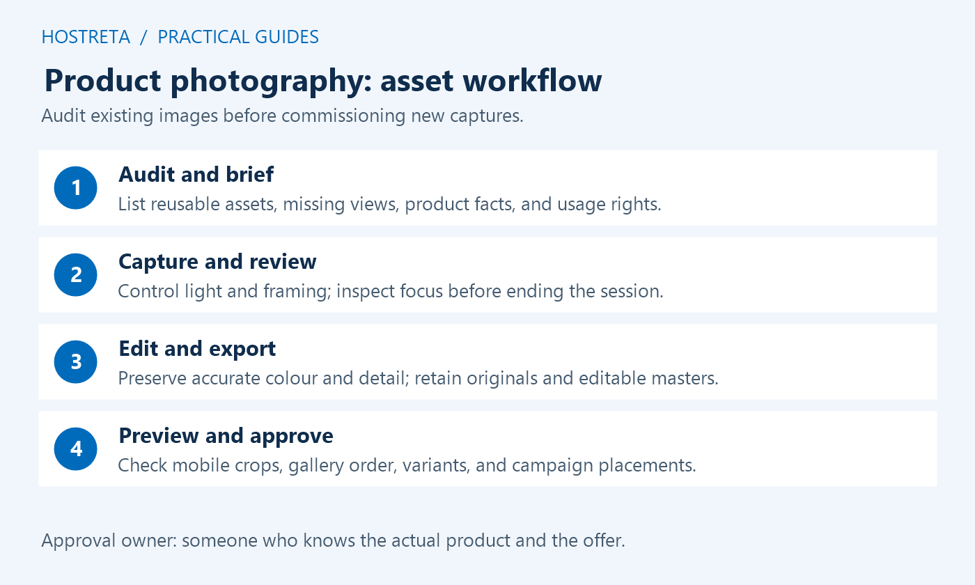
Work backwards from the campaign’s content approval date. First confirm stock, sample availability, product details, and rights. Then audit assets and approve the shot list. Reserve capture time, editing time, and a review window for corrections. Product photography plans often fail when there is no time between editing and publication to discover a wrong cover, missing angle, or unsuitable crop.
Group compatible products by setup to reduce repeated lighting changes. Capture neutral catalogue frames before adding seasonal props, then record the styled alternatives. Keep an asset log during the session so a file can be traced back to a product and variant. Do not rely on memory when several similar items share a background or packaging.
Leave a final implementation window for responsive exports, metadata, gallery order, and page testing. Coordinate with email and social production so those teams receive approved files with clear version names. When a promotion changes, update the promotional layout rather than overwriting the clean master. This keeps product photography reusable after the holiday offer ends.
Use readable names such as a product code, variant, view, and revision. Keep originals, editable masters, and delivery exports in distinct folders with a short inventory. Record the creator, permitted use, and any licence or consent reference where relevant. Do not assume a supplier image or customer photograph can be used in every advertising placement simply because it was easy to download.
Assign a single approved export for each intended slot. Avoid filenames such as “final-new-final” that hide which version the team should use. A product photography handover should say which image belongs in the main product slot, which belongs in the gallery, and which is promotional only. Include a note if a crop must not be used for shopping feeds or if a prop is not included.
If the store needs template or delivery changes, a provider such as KAWEDMA offers website development and hosting. Share the approved visual requirements and a staging example, not an unfiltered archive of unrelated files. The implementation brief should explain the desired crop, image order, responsive behaviour, and acceptance checks.
It can be, depending on the product and required detail. Review focus, colour, reflections, and the final display size. Stabilise the device and control the light before buying more equipment. Reflective jewellery, very small details, or demanding colour work may need a more specialised setup or professional help.
No. Keep a clear product view and add seasonal context where it helps. Neutral assets remain useful after the campaign and may better suit catalogue or feed requirements. Product photography should not hide the item behind props or imply that optional wrapping and accessories are included.
There is no useful universal count. Cover the necessary buying questions without duplicating nearly identical angles. Use the WooCommerce gallery documentation for implementation and test the result on the active theme. Every added image should justify its place through useful information.
The source can often be reused, but the crop, dimensions, compression, and text placement may differ. Preview both at realistic mobile sizes. Keep important details away from crop edges and provide essential offer information in accessible text rather than embedding the entire message inside an image.
Approve holiday product photography for accuracy first, clarity second, and seasonal styling around both. Keep the existing approved images when they already do the job, and commission only the missing views. A documented asset plan gives the campaign team useful visuals without turning every seasonal update into a complete catalogue reshoot.
We may earn a commission on purchases made through these links, at no extra cost to you.
Don’t miss the chance to participate in the biggest giveaway of this year.